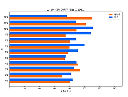
 Python Matplotlib - 가로 막대 그래프 기초 3(다중 막대 그래프)
1. 그래프 단계(셀로판지 개념)1단계 : 배경 설정(축)2단계 : 그래프 추가(점, 막대, 선)3단계 : 설정 추가(축 범위, 색, 표식) 2. Sample Data BaseDaedeok = [81, 70, 94, 91, 74, 78, 80, 81, 75, 89, 102, 110] Donggu = [84, 82, 86, 89, 75, 91, 100, 88, 108, 111, 88, 77] label = ['1월', '2월', '3월', '4월', '5월', '6월', '7월', '8월', '9월', '10월', '11월', '12월'] 3. Sample Codefrom matplotlib import pyplot import numpy Daedeok = [81, 70, 94, 91, 74, 78, 80..
Python Matplotlib - 가로 막대 그래프 기초 3(다중 막대 그래프)
1. 그래프 단계(셀로판지 개념)1단계 : 배경 설정(축)2단계 : 그래프 추가(점, 막대, 선)3단계 : 설정 추가(축 범위, 색, 표식) 2. Sample Data BaseDaedeok = [81, 70, 94, 91, 74, 78, 80, 81, 75, 89, 102, 110] Donggu = [84, 82, 86, 89, 75, 91, 100, 88, 108, 111, 88, 77] label = ['1월', '2월', '3월', '4월', '5월', '6월', '7월', '8월', '9월', '10월', '11월', '12월'] 3. Sample Codefrom matplotlib import pyplot import numpy Daedeok = [81, 70, 94, 91, 74, 78, 80..
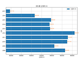 Python Matplotlib - 가로 막대 그래프 기초 2
1. 그래프 단계(셀로판지 개념)1단계 : 배경 설정(축)2단계 : 그래프 추가(점, 막대, 선)3단계 : 설정 추가(축 범위, 색, 표식) 2. Sample Data Basenewborn = [465892, 444849, 470171, 471265, 484550, 436455, 435435, 438420, 406243, 357771] year = [2008, 2009, 2010, 2011, 2012, 2013, 2014, 2015, 2016, 2017] 3. Sample Codefrom matplotlib import pyplot newborn = [465892, 444849, 470171, 471265, 484550, 436455, 435435, 438420, 406243, 357771] year =..
Python Matplotlib - 가로 막대 그래프 기초 2
1. 그래프 단계(셀로판지 개념)1단계 : 배경 설정(축)2단계 : 그래프 추가(점, 막대, 선)3단계 : 설정 추가(축 범위, 색, 표식) 2. Sample Data Basenewborn = [465892, 444849, 470171, 471265, 484550, 436455, 435435, 438420, 406243, 357771] year = [2008, 2009, 2010, 2011, 2012, 2013, 2014, 2015, 2016, 2017] 3. Sample Codefrom matplotlib import pyplot newborn = [465892, 444849, 470171, 471265, 484550, 436455, 435435, 438420, 406243, 357771] year =..
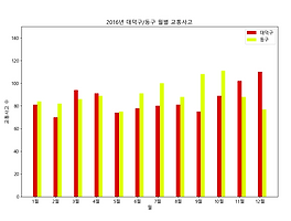 Python Matplotlib - 세로 막대 그래프 기초 3(다중 막대 그래프)
1. 그래프 단계(셀로판지 개념)1단계 : 배경 설정(축)2단계 : 그래프 추가(점, 막대, 선)3단계 : 설정 추가(축 범위, 색, 표식) 2. Sample Data BaseDaedeok = [81, 70, 94, 91, 74, 78, 80, 81, 75, 89, 102, 110] Donggu = [84, 82, 86, 89, 75, 91, 100, 88, 108, 111, 88, 77] label = ['1월', '2월', '3월', '4월', '5월', '6월', '7월', '8월', '9월', '10월', '11월', '12월'] 3. Sample Codefrom matplotlib import pyplot import numpy Daedeok = [81, 70, 94, 91, 74, 78, 80..
Python Matplotlib - 세로 막대 그래프 기초 3(다중 막대 그래프)
1. 그래프 단계(셀로판지 개념)1단계 : 배경 설정(축)2단계 : 그래프 추가(점, 막대, 선)3단계 : 설정 추가(축 범위, 색, 표식) 2. Sample Data BaseDaedeok = [81, 70, 94, 91, 74, 78, 80, 81, 75, 89, 102, 110] Donggu = [84, 82, 86, 89, 75, 91, 100, 88, 108, 111, 88, 77] label = ['1월', '2월', '3월', '4월', '5월', '6월', '7월', '8월', '9월', '10월', '11월', '12월'] 3. Sample Codefrom matplotlib import pyplot import numpy Daedeok = [81, 70, 94, 91, 74, 78, 80..
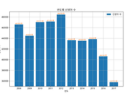 Python Matplotlib - 세로 막대 그래프 기초 2
1. 그래프 단계(셀로판지 개념)1단계 : 배경 설정(축)2단계 : 그래프 추가(점, 막대, 선)3단계 : 설정 추가(축 범위, 색, 표식) 2. Sample Data Basenewborn = [465892, 444849, 470171, 471265, 484550, 436455, 435435, 438420, 406243, 357771] year = [2008, 2009, 2010, 2011, 2012, 2013, 2014, 2015, 2016, 2017] 3. Sample Codefrom matplotlib import pyplot newborn = [465892, 444849, 470171, 471265, 484550, 436455, 435435, 438420, 406243, 357771] year =..
Python Matplotlib - 세로 막대 그래프 기초 2
1. 그래프 단계(셀로판지 개념)1단계 : 배경 설정(축)2단계 : 그래프 추가(점, 막대, 선)3단계 : 설정 추가(축 범위, 색, 표식) 2. Sample Data Basenewborn = [465892, 444849, 470171, 471265, 484550, 436455, 435435, 438420, 406243, 357771] year = [2008, 2009, 2010, 2011, 2012, 2013, 2014, 2015, 2016, 2017] 3. Sample Codefrom matplotlib import pyplot newborn = [465892, 444849, 470171, 471265, 484550, 436455, 435435, 438420, 406243, 357771] year =..
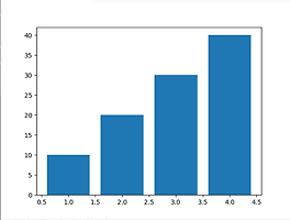 Python Matplotlib - 세로 막대 그래프 기초 1
1. Matplotlib자료를 차트나 플롯 형식으로 시각화 패키지다양한 시각화 기능 제공 2. 세로 막대 그래프집단간의 차이를 표현평균 막대 그래프 3. 설치pip install matplotlib 4. Pyplot 모듈 로드from matplotlib import pyplot 5. 기본 구조from matplotlib import pyplot Reference_axis = [1, 2, 3, 4] Value_axis = [10, 20, 30 , 40] pyplot.figure() pyplot.bar(Reference_axis, Value_axis) pyplot.show() pyplot.close() 6. 기본 구조 정리- 기준축 DB 설정(X축)Reference_axis = [1, 2, 3, 4] - 데..
Python Matplotlib - 세로 막대 그래프 기초 1
1. Matplotlib자료를 차트나 플롯 형식으로 시각화 패키지다양한 시각화 기능 제공 2. 세로 막대 그래프집단간의 차이를 표현평균 막대 그래프 3. 설치pip install matplotlib 4. Pyplot 모듈 로드from matplotlib import pyplot 5. 기본 구조from matplotlib import pyplot Reference_axis = [1, 2, 3, 4] Value_axis = [10, 20, 30 , 40] pyplot.figure() pyplot.bar(Reference_axis, Value_axis) pyplot.show() pyplot.close() 6. 기본 구조 정리- 기준축 DB 설정(X축)Reference_axis = [1, 2, 3, 4] - 데..


