반응형
1. HTML Code
<!doctype html>
<html>
<head>
<meta charset="utf-8">
<title>무제 문서</title>
<meta name="viewport" content="user-scalable=no, initial-scale=1.0, maximum-scale=1.0, minimum-scale=1.0, width=device-width">
<link href="css/ex04.css" rel="stylesheet">
</head>
<body>
<body>
<div id="container">
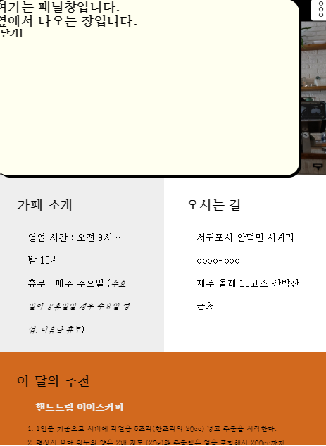
<div id="panel">
<h1>
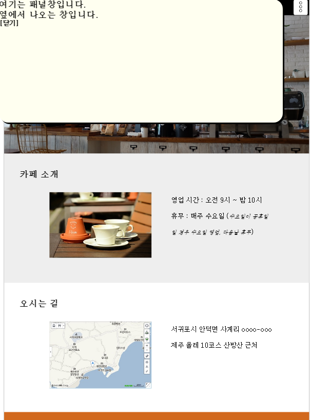
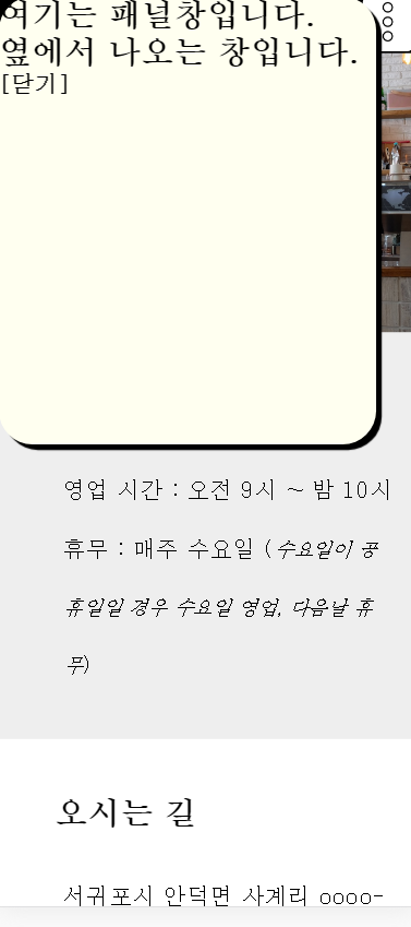
여기는 패널창입니다.<br>
옆에서 나오는 창입니다.</h1>
<h2>
<a href="#">[닫기]</a>
</h2>
</div>
<header>
<nav>
<ul id="main-nav">
<li><a href="#intro">카페 소개</a></li>
<li><a href="#map">오시는 길</a></li>
<li><a href="#choice">이 달의 추천</a></li>
</ul>
<a href="#panel" class="hambug"> <img src="img/more.png"> </a> </nav>
</header>
<div class="mama">
<section id="intro">
<div class="page-title">
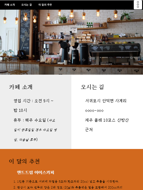
<h1>카페 소개</h1>
</div>
<div class="content">
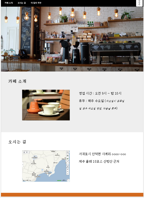
<div class="photo"> <img src="img/coffee.jpg" alt=""> </div>
<div class="text">
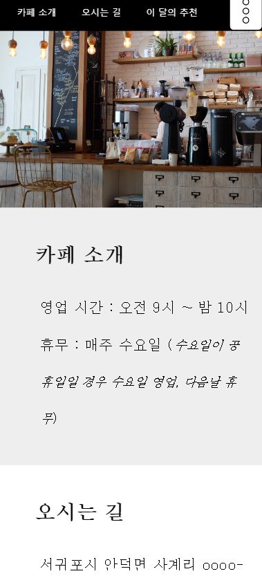
<p> 영업 시간 : 오전 9시 ~ 밤 10시 </p>
<p> 휴무 : 매주 수요일 (<i><small>수요일이 공휴일일 경우 수요일 영업, 다음날 휴무</small></i>)</p>
</div>
</div>
</section>
<section id="map">
<div class="page-title">
<h1>오시는 길</h1>
</div>
<div class="content">
<div class="photo"> <img src="img/map.jpg" alt="사계 포구에서 서쪽 방향으로 000미터 진행"> </div>
<div class="text">
<p>서귀포시 안덕면 사계리 oooo-ooo</p>
<p>제주 올레 10코스 산방산 근처</p>
</div>
</div>
</section>
<section id="choice">
<div class="page-title">
<h1>이 달의 추천 </h1>
</div>
<div class="content">
<div class="photo"> <img src="img/ice.jpg" alt="아이스 커피" style="border:1px solid white; border-radius:50%"> </div>
<div class="text">
<h2>핸드드립 아이스커피</h2>
<ol>
<li>1인분 기준으로 서버에 각얼음 5조각(한조각의 20cc) 넣고 추출을 시작한다.</li>
<li>평상시 보다 원두의 양은 2배 정도 (20g)와 추출액은 얼음 포함해서 200cc까지 내린다.</li>
<li>아이스 잔에 얼음 6~7개 섞어서 시원하게 마신다</li>
</ol>
</div>
</div>
</section>
</div>
<footer>
<p>My times with Coffee</p>
</footer>
</div>
</body>
</html>
2. CSS Code
@charset "utf-8";
/* CSS Document */

* {
	margin: 0 auto;
	padding: 0;
}
/* 공통 스타일 */
body {
	font-family: serif;
}
a {
	text-decoration: none;
}
a:link, a:visited {
	color: white;
}
a:active {
	color: yellow;
}
h1 {
	font-size: 1.8em;
}
h2 {
	font-size: 1.3em;
}
p {
	font-size: 1.3em;
	line-height: 2.5;
}
*#container {
	width: 100%;
}
header {
	width: 100%;
	height: 300px;
	background: url(../img/header.jpg);
	background-size: cover;
}
nav {
	height: 50px;
	background: black;
}
#main-nav {
	padding: 10px;
}
#main-nav li {
	display: inline-block;
	color: white;
	font-size: 0.8em;
	margin: 5px 15px;
	font-family: '맑은 고딕';
}
section {
	width: 100%;
	padding: 15px 5% 10px 5%;
	position: relative;
}
/* 짝수번호 색깔넣기 */
#container section:nth-child(odd) {
	background: #eee;
}
.page-title {
	position: absolute;
	top: 20px;
	left: 0;
	padding: 30px 50px;
}
.page-title h1 {
	margin-bottom: 30px;
}
.content {
	margin: 80px auto 10px;
	width: 90%;
	padding: 20px;
	box-sizing: border-box;
}
.content ol {
	margin-top: 20px;
}
.photo {
	display: none;
}
.text h2 {
	color: #eee;
}
.text li {
	line-height: 2;
	font-size: 1.0em;
}
footer {
	position: relative;
	width: 100%;
	height: 100px;
	background: black;
}
footer p {
	font-family: cursive;
	font-size: 1.5em;
	color: white;
	text-align: center;
	line-height: 100px;
}

/* 태블릿 */
@media all and (min-width:760px) {
header {
	height: 400px;
	transition: 1s;
}
.mama {
	display: flex;
	flex-wrap: wrap; /* 여러줄로 박스 표시 */
}
#intro, #map {
	box-sizing: border-box;
	width: 50%;
	height: 400px;
		/* float:left; */
	border 1px dotted gray;
}
#choice {
	width: 100%;
	background: chocolate !important;/* clear:left; */
}
}

/* PC */
@media all and (min-width:992px) {
#container {
	width: 990px;
	border: 1px solid gray;
}
header {
	height: 500px;
}
#intro, #map, #choice {
	clear: both;
	position: relative;
	width: 100%;
	height: 420px;
	padding: 15px 2% 10px 5%;
}
.content {
	margin: 90px auto 10px;
	width: 90%;
	padding: 20px;
	display: flex;
}
.photo {
	width: 42%;
	display: block;
}
.photo>img {
	width: 100%;
	height: auto;
	margin-bottom: 30px;
}
.text {
	width: 42%;
}
.mama {
/* display:flex; */
}
footer {
	clear: both;
}
}
a.hambug {
	position: absolute;
	display: block;
	background: white;
	padding: 5px;
	right: 5px;
	top: 0;
	border-radius: 5px;
}
nav {
	position: relative;
}
a.hambug img {
	width: 35px;
	height: 35px;
}
#panel {
	width: 90%;
	height: 400px;
	background: ivory;
	position: absolute;
	left: -100%;
	top: 0px;
	transition: 1s;
	box-shadow: 5px 5px 1px black;
	border-radius: 30px;
}
#panel a {
	color: black;
}
.container {
	position: relative;
}
#panel:target {
	left: 0;
	z-index: 1;
	top: 0px;
}
a.hambug:active {
	top: 1px;
}
3. 미리보기
4. HTML / CSS 파일
반응형
'Python_WEB > HTML' 카테고리의 다른 글
| [Tistory-플러그인]기본 스킨 방문객 카운터 HTML Code (0) | 2019.10.29 |
|---|---|
| HTML5 - 190701 Basic Study 69(반응형 웹) (0) | 2019.07.01 |
| HTML5 - 190701 Basic Study 67(그리드 시스템) (0) | 2019.07.01 |
| HTML5 - 190701 Basic Study 66(반응형 웹 기초 구성) (0) | 2019.07.01 |
| HTML5 - 190701 Basic Study 65(프린터, 모니터 CSS) (0) | 2019.07.01 |


