반응형
1. HTML Code
<!doctype html>
<html>
<head>
<meta charset="utf-8">
<title>9일차</title>
<meta name="viewport" content="user-scalable=no, initial-scale=1.0, maximum-scale=1.0, minimum-scale=1.0, width=device-width">
<link href="css/ex03.css" rel="stylesheet">
</head>
<body>
<h1>그리드시스템</h1>
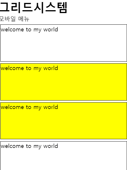
<nav class="mobile">모바일 메뉴</nav>
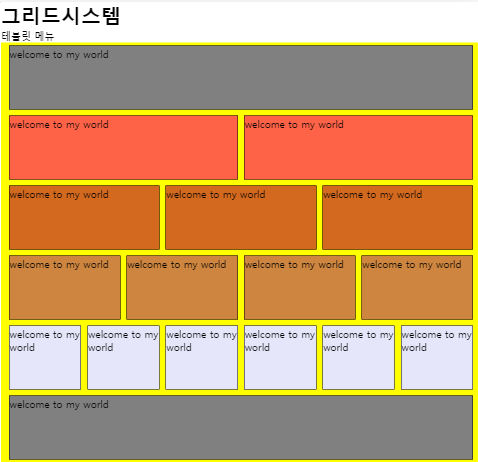
<nav class="tablet">테블릿 메뉴</nav>
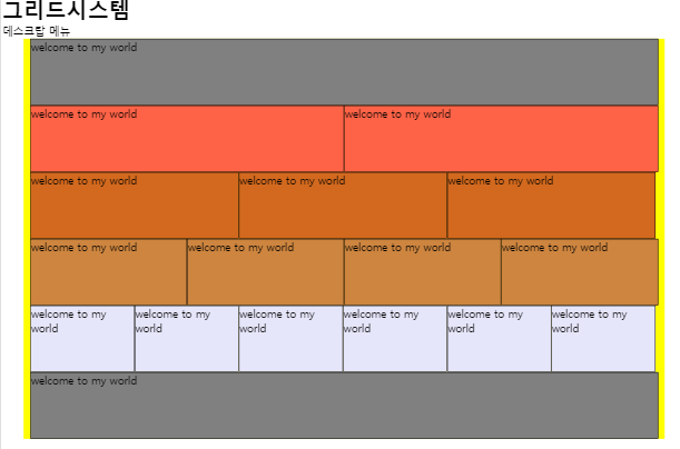
<nav class="desk">데스크탑 메뉴</nav>
<div class="container">
<div class="row">
<div class="grid12">welcome to my world</div>
</div>
<div class="row">
<div class="grid6">welcome to my world</div>
<div class="grid6">welcome to my world</div>
</div>
<div class="row">
<div class="grid4">welcome to my world</div>
<div class="grid4">welcome to my world</div>
<div class="grid4">welcome to my world</div>
</div>
<div class="row">
<div class="grid3">welcome to my world</div>
<div class="grid3">welcome to my world</div>
<div class="grid3">welcome to my world</div>
<div class="grid3">welcome to my world</div>
</div>
<div class="row">
<div class="grid2">welcome to my world</div>
<div class="grid2">welcome to my world</div>
<div class="grid2">welcome to my world</div>
<div class="grid2">welcome to my world</div>
<div class="grid2">welcome to my world</div>
<div class="grid2">welcome to my world</div>
</div>
<div class="row">
<div class="grid12">welcome to my world</div>
</div>
</div>
</body>
</html>
2. CSS Code
@charset "utf-8";
/* CSS Document */

*{
	margin:0 auto;
	padding:0;
}

nav{
	display:none;
}
/* 모바일퍼스트방식 */
/* 데스크탑퍼스트방식 */
/* 반응형 웹 그리드 */
/* 모바일 1단 */
@media screen and (max-width:640px){
	[class*=grid]{
		height:100px;
		margin:5px;
		border:1px solid black;
	}
	.grid6{
		background:yellow;
	}
	.mobile{
		display:block;
	}
}

/* 동적그리드 - 유동형 */
@media screen and (min-width:641px) and (max-width:959px){
	.container{
		width:100%;
		background:yellow;
		}
	.row{
		width:98%;
		overflow:hidden;
		display:flex;
		}
	.grid12{
		width:100%;
		background:gray;
		}
	.grid6{
		width:50%;
		background:tomato;
		}
	.grid4{
		width:33.3%;
		background:chocolate;
		}
	.grid3{
		width:25%;
		background:peru;
		}
	.grid2{
		width:16.6%;
		background:lavender;
		}
	[class*=grid]{
		height:100px;
		border:1px solid black;
		margin:5px;
	}
	.tablet{
		display:block;
	}
}

/* 정적 그리드 - 고정형*/
@media screen and (min-width:960px){
.container{
	width:960px;
	background:yellow;
	}
	.row{
	width:940px;
	overflow:hidden;
	}
	.grid12{
	width:940px;
	background:gray;
	}
	.grid6{
	width:470px;
	background:tomato;
	}
	.grid4{
	width:312px;
	background:chocolate;
	}
	.grid3{
	width:235px;
	background:peru;
	}
	.grid2{
	width:156px;
	background:lavender;
	}

	[class*=grid]{
	float:left;
	border:1px solid black;
	height:100px;
	}
	.container *{
	box-sizing:border-box;
	}
	.desk{
		display:block;
	}
}
3. 미리보기
4. HTML / CSS 파일
반응형
'Python_WEB > HTML' 카테고리의 다른 글
| HTML5 - 190701 Basic Study 69(반응형 웹) (0) | 2019.07.01 |
|---|---|
| HTML5 - 190701 Basic Study 68(Cafe 페이지 제작) (0) | 2019.07.01 |
| HTML5 - 190701 Basic Study 66(반응형 웹 기초 구성) (0) | 2019.07.01 |
| HTML5 - 190701 Basic Study 65(프린터, 모니터 CSS) (0) | 2019.07.01 |
| HTML5 - 190623 Basic Study 64(에릭마이어 reset.css) (0) | 2019.06.23 |


